Making UI easier to use and easier to ship.
The guidelines had piled up shades, tints and local variations — every one another decision. I cut them down to a palette of roles and worked with Frontend to turn reusable patterns into a production component library.
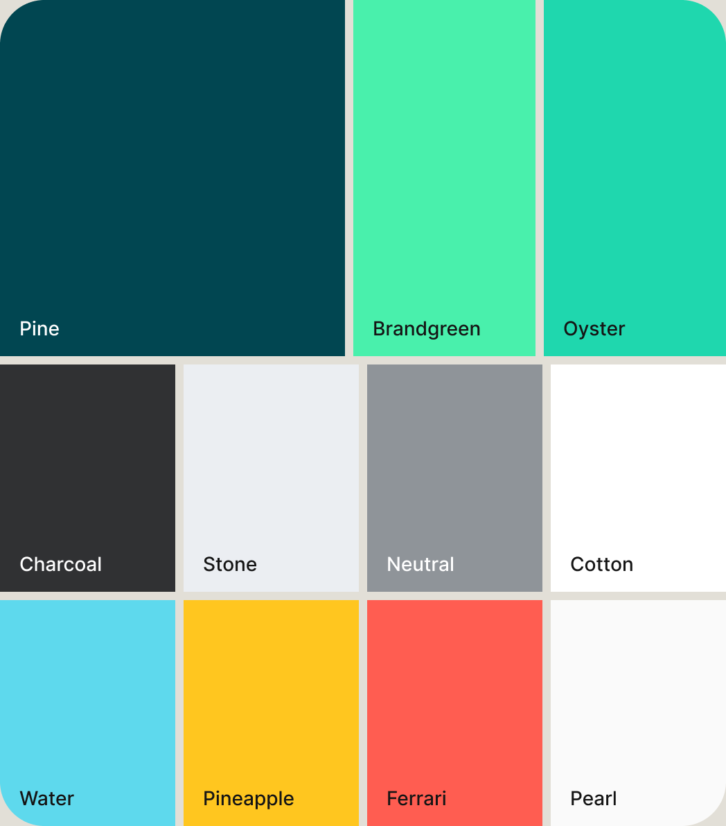
From color options to a shared component model
Audit the legacy system
A broad shade and tint matrix with many similar choices and room for inconsistency.
Simplify the palette
Reduced to primary, secondary and complementary colors, each with a clear purpose.
Align design with code
Worked with two Frontend Engineers so Figma and production shared one component model.
Apply the system to onboarding
Applied the updated design system to the constantly evolving onboarding experience, making it easier to maintain and adapt as requirements changed.
Less reinvention
Common patterns could be reused instead of rebuilt.
Faster iteration
Small onboarding changes could happen at component level.
Shared language
Design and Frontend worked from the same component logic.
Easier revamps
Larger changes were simpler because flows were already componentized.
Three moves behind the system
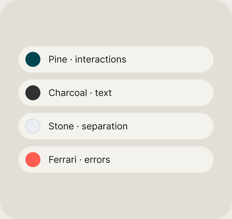
Colors as roles
A smaller palette in three tiers, each color with a clear job.
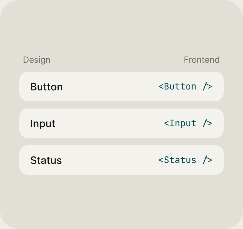
One component logic
Figma and production built from the same model, not interpreted from a reference.

Onboarding as a stress test
Same shell, different fields, new states — change the piece, not the whole screen.