Spaces
Helping more people organize their money for what matters.
Spaces splits money into sub-accounts for different goals. Clearer guidance, an emergency-savings use case and contextual messaging made it easier to understand and start using.

Money that feels purposeful
Mapped the journey
Traced the existing flow to find where people lost the thread.
Framed the intervention
Used behavioral-science framing to define what to change.
Designed flows, UI & notifications
From first explanation to the nudge on the lock screen.
Shipped with engineering
Stayed close through implementation and delivery decisions.
+20% interaction
More customers opened, created and used Spaces.
A reason to save
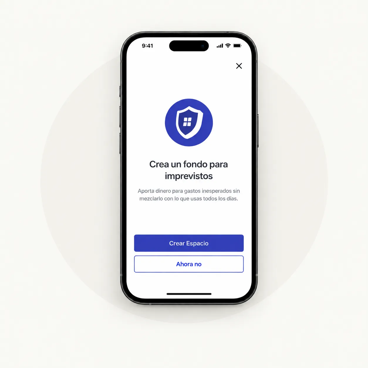
Emergency savings gave the feature a concrete first use.
Validated, not guessed
12 usability sessions and an experiment across 6 groups.
Three moves behind the number
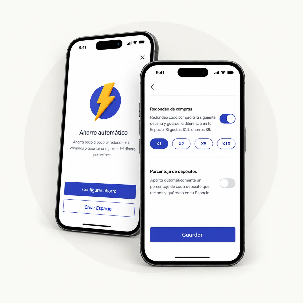
Make the feature legible
Context on what Spaces are, how they work and why you’d use one.
Give savings a reason
An emergency-savings flow built around a relatable use case.

Show up at the right moment
In-app and push messages at the moments that matter.