Virtusan
From a daily energy metaphor to a product centered around a Coach.
Virtusan’s smart ring tracks HRV, sleep, heart rate, stress and more. The app already had the data, but it wasn’t always clear what users should do with it. I rethought the homepage from the concept up, then tested the direction across two rounds of research.
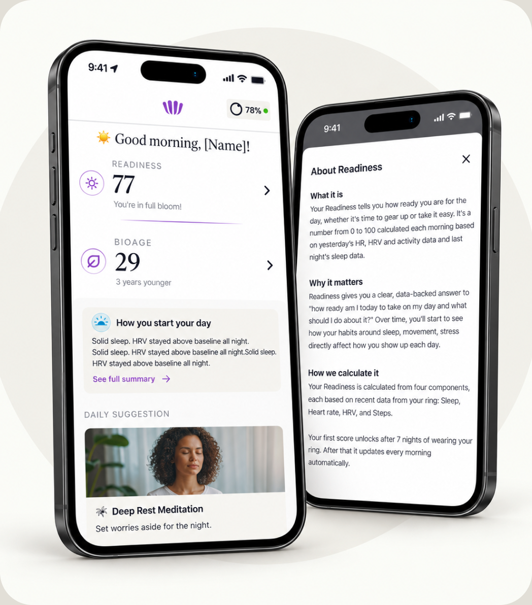
From battery
to coach
Rethink the homepage
Ran an internal workshop to explore and validate what users would expect to see when opening the app.
Build a research plan
Designed and executed a three-phase research plan to validate concepts, new features, and the usability of the final app.
Improve the current experience
Designed and implemented quick UX improvements while researching and validating the future direction of the app.
Conduct user research
Conducted 43 one-on-one sessions with Virtusan users to gather feedback and inform product decisions.
A validated direction
The Coach as the product’s center, with metrics as the proof layer.
A settled architecture
Summary first, drill-down always available — now the pattern for the whole app.
A reusable research system
Template, signal scale and cross-session matrix the team keeps using.
Clear guardrails
No fatalistic forecasts of bad days, and no stress push alerts.
Three moves behind the pivot
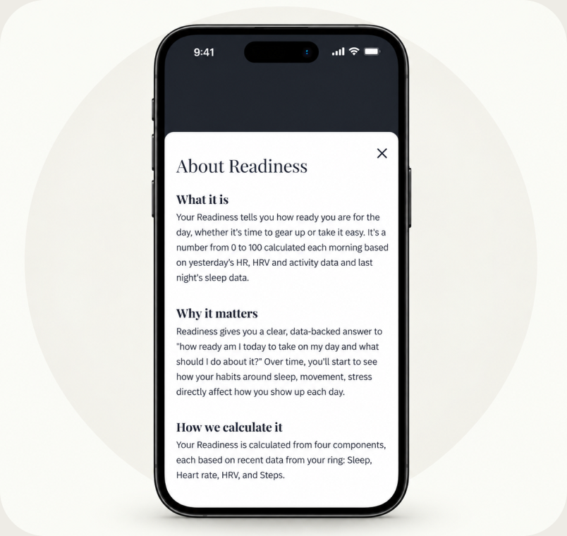
A clearer Readiness score
One morning score based on four signals compared with the user’s baseline, plus a breakdown of what affected it.
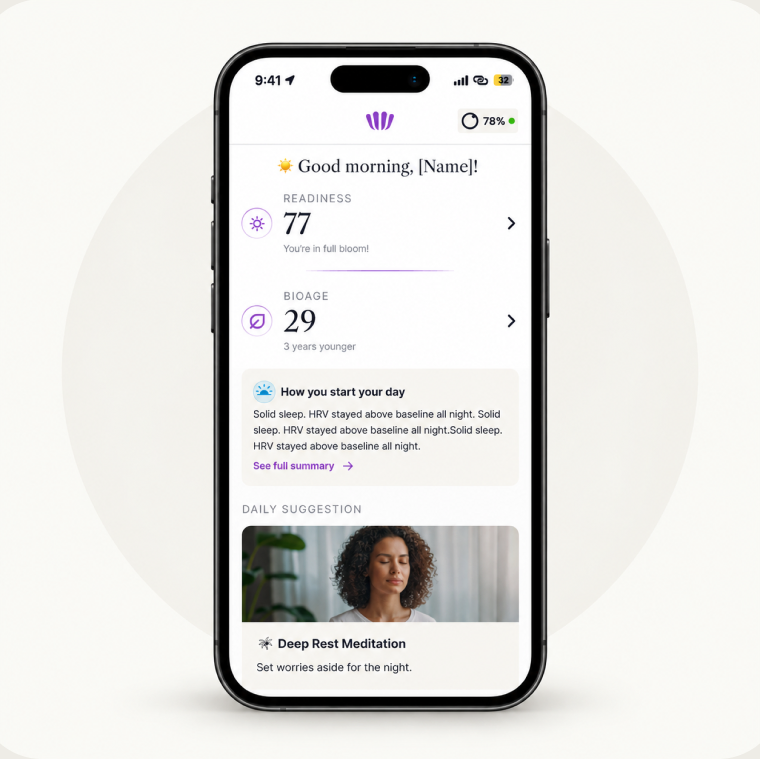
The Coach
A short list of daily actions based on the day’s Readiness, including morning light, a caffeine cutoff, lights out and one protocol.
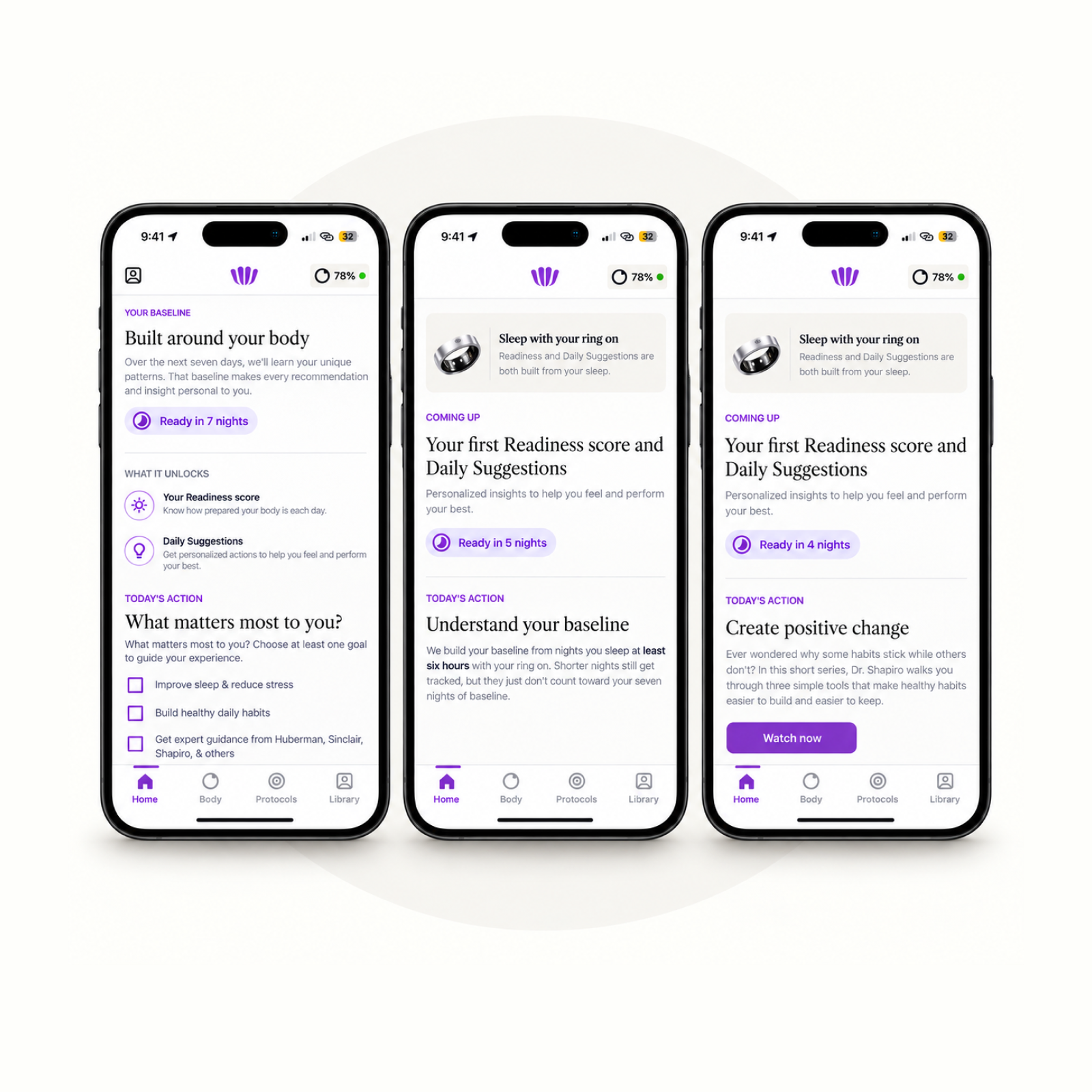
From 21 days to a 7-day baseline
Redesigned the baseline experience to reduce the wait from 21 to 7 days, while collecting qualitative data to help personalize the Coach’s first recommendations.